Saturday, December 30, 2017

The Drowned World


Climate Central's Surging Seas map has always been a very effective visualization of the possible effects of rising sea levels. It is even more effective when you combine it with Google Earth's incredible 3d map of the world.

Google Earth for the web now supports kml files. This means that you can import the Surging Seas: Extreme kml file into Google Earth and explore how rising seas might effect the USA. The realism of Google Earth's 3d buildings really increases the impact of Climate Central's rising seas model and helps to communicate the effect of global warming on our coastal towns and cities.

Surging Seas: Extreme is based on the 'extreme' scenario published in NOAA's report into Global and Regional SLR Scenarios for the U.S. (January 2017). Unfortunately for Donald Trump if global warming does exist then he can say goodbye to Mar-a-Lago which will be almost completely inundated by rising seas under this model (mind you Trump will be dead by then so why should he care).

By the total number of the population affected using this model Florida would be the most affected state, followed by New York, California, Virginia, and New Jersey. Florida is also the most affected state by the percentage of the population affected, followed by Hawaii and Louisiana.

Friday, December 29, 2017

Location Sharing for Artists


Place to Paint is Google Maps for artists. It is an application which you can use to share the locations where you enjoy to paint and the artworks which you have created there. Place to Paint is also a great place to list and share the latest artistic events in your area, such as studio open houses, artist meetings and exhibitions.

You can use Place To Paint to find great locations where other artists like to paint. You can also use Place to Paint to share your own favorite places to paint. You can even post photos of your paintings and leave useful information about the location for other artists, such as nearby public transport and restaurants.

Place to Paint uses two different types of map marker to indicate shared locations and upcoming art events. Just click on a marker on the map to find out about the shared location or the listed event.

Thursday, December 28, 2017

The Antarctic Mapping Challenge


Barney Swan, Martin Barnett and Kyle O’Donoghue are currently undertaking a grueling 600-mile, 60-day trek to the South Pole. You can follow their progress on an interactive map. The South Pole Energy Challenge map shows the progress made so far and also features video updates and photos taken on this epic 600-mile journey.

The interactive map of the trek features aerial imagery of Antarctica, the locations of Scott's hut & a number of geographical features such as the ice shelves. Two small buttons on the map allow you to access biographical information about Barney Swann and his father Robert Swann. The large yellow map marker shows you the current position of the three remaining explorers.

Looking at the source-code for the map it appears that the mapping company ZeroSixZero has created their own polar projection map of Antarctica using map data from a number of different sources (credited on the map). This polar projection has then been imported into Leaflet.js using the Proj4Leaflet plugin for map projections not natively supported by Leaflet.

If you want to map the other end of the Earth then you can always use the Arctic Web Map, an Arctic specific web mapping tool, consisting of an Arctic-focused tile server.

Where Catalans Want Independence


The results of the latest regional elections in Catalonia show a similar geographical split between urban and rural voters as has been seen in other recent elections around the world. After both the United States Presidential election and the Brexit referendum in the UK many observers noted divergent voting patterns among rural and urban voters. In both these cases poorer, more rural areas showed more support for the anti-establishment candidate or position. The more affluent and urban areas were more likely to vote for what were seen as the establishment candidate or position.

This geographical split in supporting the establishment or anti-establishment position can be seen in the most recent Catalan regional elections. Last week we looked at La Vanguardia's interactive map of the Catalan Regional Election, which shows the political party with the most votes in each municipality. This map revealed that the Pro-Independence parties did best in rural areas of Catalan, while the pro-Unionist parties got their best results in more populated, urban areas.

This urban - rural split for Catalan independence is examined more closely by El Diario. El Diario's Analysis of 21D uses a series of charts, cartograms and maps to examine how support for the pro and anti independence political parties has changed since the last regional elections. It also examines where there is most support for independence in the region and which areas show most support for remaining a part of Spain.

The pro-Unionist parties won the majority of votes in the big cities. While the rural areas in the region showed the most support for independence. However this urban-rural split isn't the only pattern picked up by El Diario's analysis. Perhaps unsurprisingly one of the strongest indicators of a high independence vote in a municipality is the percentage of its inhabitants born in Catalonia. Those municipalities with the most voters born in Catalonia showed the biggest support for independence. Non-Catalan born voters were more likely to vote for pro-Unionist parties and these voters tend to live in the big cities and more urban areas of Catalan.

Sunday, December 24, 2017

Tracking Santa at Christmas


Santa has begun work on his busiest day of the year. The Official NORAD Santa Tracker is also now busy at work.

Every Christmas NORAD's geo-synchronous satellites are able to detect the signature from Rudolph's red nose and observe when Santa Claus leaves the North Pole. They then proceed to track his movements for 24 hours as Santa delivers presents to children around the world. You can follow Santa's movements today on the NORAD Santa Tracker.

While following along with Santa's global journey you can also listen to a selection of Christmas songs, played by the NORAD Commanders or the US Air Force Academy Band.

You can also follow Santa's progress this Christmas Eve on Google's Santa Tracker. Google uses GPS (the Gnome Positioning System) to track Santa's sleigh on Christmas Eve. They then plot his movements around the world on a real-time Google Map. While you follow Santa on Google Maps the sleigh dashboard keeps track of the number of presents delivered and the time remaining until Santa delivers your presents.

Saturday, December 23, 2017

Airport Traffic at Christmas


Esri has released a series of animated maps to visualize the incredible amount of holiday traffic around major airports. Passengers traveling through airports over the next few days could experience long wait times and delays. The communities around America’s biggest airports are also impacted this time of year as millions of people travel to and from America's busiest airports.

Using historical traffic data from HERE, Esri has analyzed traffic trends from the past three years for December 23rd (a peak travel day). The Holiday Travels Story Map shows how far you can drive in an hour from America’s five busiest airports during the holiday season. The map uses animated maps to show how the amount of traffic changes around LAX, DFW, ORD, ATL, and JFK throughout one 24-hour period before Christmas.

How Holiday Travel Affects Traffic around America’s Busiest Airports also visualizes how far you can drive in an hour from America’s five busiest airports. It looks in a little more detail at holiday traffic around airports in each city. This map also allows you to view the live traffic conditions for the whole US, as well as each city and airport.

Tour Holiday Traffic around America’s Busiest Airports shows how the temporal nature of traffic affects how far you can drive in an hour from each of America’s five busiest airports.

Friday, December 22, 2017

Catalan Regional Election Map


Pro-Independence parties in Catalan have just held on to a slim majority in a snap regional election. The election was called by the Spanish government who were hoping that the pro-unionist Citizens party would be able to defeat the secessionists. The Citizens party did pick up the most seats (37) of any single party but the three separatist parties between them picked up 70 seats in the regional parliament.

La Vanguardia has published an interactive map of the Catalan Regional Election, showing the winner in each municipality. The color of each municipality on the map indicates the party with the most votes:

Yellow - Republican Left of Catalonia (pro-independence)
Blue - Junts per Catalunya (pro-independence)
Red - Socialists' Party of Catalonia (pro-independence)
Orange - Citizens (pro-Unionist)

If you select an area on the map you can view the number & percentage of the votes won by the leading party and the number & percentage of votes picked up by the second most popular party in each municipal area. La Vanguaridia's map shows the results by municipal area rather than by electoral area. This tends to portray a distorted picture of the overall results (which is perhaps what the newspaper wants to do). However it does mean that you can view the most popular party in each town in Catalan.

Thursday, December 21, 2017

Busing the Homeless


Thousands of one-way bus tickets are given to the homeless every year in the United States. In Bussed out: How America moves its homeless the Guardian newspaper explores the reasoning behind homeless bus relocation programs, their effect on the homeless and the impact on the cities where the bused out homeless end up.

As you scroll through the Guardian's article an interactive map automatically updates to visualize the results of the homeless relocation programs run by cities across America. This map shows the homeless rate in each state and the number of homeless arriving in cities across the country.

New York city spends the most money of any city on their homeless relocation programs. In fact New York doesn't just bus its homeless problem on to other cities it also give homeless citizens free flights to other cities. As with the bus relocation programs most of the people moved on by plane end up in locations with an average lower median income.

What's in a Name?


The British are a warm and generous people. Over the centuries they have welcomed the Vikings, the Romans, Saxons and Normans into their homes. They have even allowed them to name their towns and cities. As a result the origins and meanings of Britain's place-names are as varied as the country's many invaders.

Toponymy by Emu Analytics is a great resource for exploring the linguistic origins of place-names in the UK. The map allows you to select individual 'languages' and 'language families' to view the geographical distribution of place-names which have a common language root. The map also includes a regex search option which allows you to search for substrings in place-names, for example to view all the towns and villages ending in 'thorpe' (old Norse word for 'homestead').

By using the language filters and the regex search option it is possible to view where different invaders of Britain settled in the country based on the geographic distribution of their influence on the country's place-names.


Places! is another useful resource for anyone interested in the geographical distribution of place-names. Places! allows you to map the relative density of place-names in a number of different countries around the world. Using the application you can enter place-name prefixes or suffixes and view a map showing the geographic distribution of place-names containing those terms.

For example, in the UK we can enter the place-name suffixes of -thorpe and -thwaite to see where the Vikings settled in Britain. The resulting map shows that these two place-name endings are popular throughout the area that was once known as the Danelaw, following the Viking invasions of the ninth century.

If we take two more common town endings, such as -ford or -bridge we find that the geographic distribution of places with these endings is far more evenly spread across the UK.

The historical influence of the Vikings in the area once known as Danelaw can also be observed in the geographical distribution of English surnames. If you enter a surname into named then it will show you a heatmap highlighting where there is an unusually high number of people with that name in the UK.

Surnames ending in 'son' are usually an indicator of Viking ancestry in the UK. Enter names such as 'Johnson' and 'Robertson' into named and you will find that these surnames are more common in the Danelaw area than elsewhere in the UK.

Wednesday, December 20, 2017

Mapping London's Vicious Poor


Charles Booth was an English philanthropist who is most famous for his research into working class life in London at the end of the 19th Century. In the 1800's a large proportion of London's population lived in poverty. Charles Booth wanted to know who they were and where they lived. He therefore carried out a huge study into the lives and working conditions of Londoners.

He published the results of his research in 'Life and Labour of the People in London'. The publication included detailed 'Maps Descriptive of London Poverty' in which the levels of poverty and wealth in London were mapped out street by street. 450 notebooks were also completed during the study, in which his researchers wrote detailed descriptions of London's streets and their inhabitants.

You can explore Booth's maps and notebooks of 19th Century London on the LSE's Charles Booth's London website. The maps and notebooks provide an amazing resource into the character and people of each London street in the 19th Century.

On Booth's maps individual buildings in each street are colored to indicate the occupants' social class. If you select the 'notebooks' option on the map you can view the notebooks relevant to each street and click through to read the appropriate notebook entry for a street. When you browse the notebook section of the LSE's Charles Booth's London you can also find links to the appropriate location on Booth's maps of London.

The LSE's Charales Booth's London also includes a maps download section where you can download and print any of the individual map sheets from the printed Maps Descriptive of London Poverty, 1898-9.

Tuesday, December 19, 2017

The History of Data Visualization


The historical data visualizations in the David Rumsey Collection has been very popular on social media in the past week. If, like me, you are interested in early examples of mapped visualizations you might also like Info We Trust's History of Infographics timeline. Although this interactive timeline isn't restricted to mapped visualizations it does provide a fascinating insight into the earliest known examples of choropleth maps, geological maps and other types of data maps.

This interactive timeline explores the history of data visualization by providing a chronology of some of the earliest examples of different types of information graphics. The timeline itself is in the style of John Ogilby’s 1675 Britannia Atlas. If you are interested in viewing Ogilby's original strip map up close and in detail the David Rumsey Collection has a composite map of The Road from London to Aberistwith.

The History of Infographics is interactive. You can click on any of the historical examples on the timeline to find out more about these early examples of data visualization. Each of the examples also includes a link which takes you to a website which explores the selected information graphic in more detail.

Finding the Artistic Heart of Paris


Certain areas of Paris, such as the Left Bank and Montmartre, are synonymous with art and artists. However the artistic center of Paris is as fluid as fashion and the cost of studio and living space. Over the years Paris' artistic center has moved around the city, as artists have discovered new places to live and work

To analyze the evolution of Paris's artistic geography the Geography of the Parisian Art Market has mapped the addresses of art merchants in the city since 1815. The map shows the location of every 'picture merchant' listed in the Directory of Commerce between 1815 and 1954. Each marker on the map corresponds to a single merchant, an address and the date of the entry.

You can use the time line above the map to select a date range to view on the map. If you drag the timeline you can view how the addresses of art merchants have moved around Paris over the years. The map allows you to switch between the marker view and a heat-map view. If you switch to the heat-map view you can get a real sense of where art merchants have been most concentrated in Paris during different periods in the city's history.

Monday, December 18, 2017

Social Cleansing in the USA


When my neighborhood hosted the Olympics in 2012 the supposedly left-leaning local council decided it was the perfect opportunity to compulsory purchase the homes of local residents. It wanted to sell off the properties of local working-class families to property developers (for a profit), with no plans to rehouse the locals in the new private development.

This form of covert social cleansing has a long history in both the UK and the USA. In the U.S. the post-war federal Urban Renewal program, that ran from 1950-1966, provided funding to local governments to acquire and clear 'blighted' neighborhoods. Residents who were displaced under the scheme were meant to receive compensation, in the form of money, assistance in relocating or public housing. In reality "these federally guaranteed measures were often too meager, late in coming, or never delivered". People who were displaced often didn't receive a fair market rate for their compulsory purchased homes.

The University of Richmond's Renewing Inequality is a visualization of this program of urban renewal and displacement. An interactive map shows the cities where families were displaced by urban renewal. It provides information on the number of families displaced in each city and the number of families displaced in each year. It also shows the ethnicity of the displaced families. You can switch from the map view of the data to a cartogram or chart view. The chart view in particular reveals the hidden racism in the Urban Renewal program.

How Many ISP's Do You Have?


One of the main arguments that the cable companies used in their campaign to end the rules that ensure the internet remains open is that the free market will protect consumers. They argue that if they start to rip-off customers then customers will simply move elsewhere. The major problem with this argument is that a huge number of consumers don't have a choice of broadband providers. If their ISP starts charging more or throttling certain websites then they have nowhere else to go.

You can find out how many broadband providers operate in your area using a new interactive map. Mapbox has used FCC data to show FCC Providers throughout the United States. If you enter your address into the map you can view how many ISP providers there are at your address and the name of each provider. The map is color coded to show the number of ISP's in each area. If you click on the map you can view the actual names of the ISP's at that location.

Esri has also released a number of interactive maps which explore How Net Neutrality Could Affect You. These include maps that look at where Americans are most likely to engage in high-bandwidth, high-visibility behaviors (such as streaming movies or playing games online) and where people currently have the greatest access to high speed internet.

Vienna Through Time


Urban Change In Time is a great mapped visualization of how the city of Vienna has changed through time. The site uses a combination of building age data and vintage maps to show how Vienna has developed since the 1600's.

To a large extent Vienna is a modern city. 42% of current buildings in Vienna were built after World War II. However around a third of Vienna's buildings were built in the Gründerzeit period (the decades preceding the great stock market crash of 1873). You can explore the present age of Vienna's buildings for yourself by selecting the 'buildings mode' on the interactive map. Just use the timeline below the map to explore which buildings were built in which year.

You can explore the vintage maps of Vienna by selecting the 'image mode' Just click on any of the dots on the map timeline to load that year's vintage map of Vienna.

Sunday, December 17, 2017

How Net Neutrality Could Affect You

On Thursday the three Republican commissioners on the Federal Communications Commission (FCC) voted to end the rules that ensure the internet remains open. This means that cable companies and other internet providers will now be able to regulate which websites you can access and charge you more for delivering certain services over the internet.

In response to the Net Neturality vote Esri has created a number of interactive maps to illustrate the current state of internet access and behavior across the United States. The maps explore the internet connection types common in different areas of the U.S. and highlight the communities that have already been left behind in the digital divide. The maps help to provide a critical context for understanding how and where potential changes to net neutrality will most impact Americans.


The What Do Americans Do Online? map shows where Americans are most likely to engage in the type of high-bandwidth, high-visibility behaviors (such as streaming movies or playing games online) that are believed to be most impacted by potential changes to net neutrality.

The map uses a choropleth layer to highlight the areas where the potential impact of net neutrality is highest and lowest. Using the map you can check to see if you live in an area where internet providers might be tempted to start testing new, more expensive, business models.

The State of Internet Access map shows where people currently have the greatest access to high speed internet and explores which type of connection (cable, fiber optic, or DSL) is most common in each community.

The Access Addicts map uses Esri’s market potential data to identify the ZIP Code areas with the highest percentage of adults spending at least 10 hours a day online. In every one of these 10 ZIP Codes at least 10% of the adults spend more than ten hours hours a day online. The map also shows the total population and the median income in these ZIP Codes.

All of these areas, as well as having the highest internet usage, have above average median incomes. They could well be the ideal place for the cable companies to start testing pay-for-play business models.

The High Speed Internet Deserts Map shows the areas with the worst access to the internet. This map uses Esri’s market potential data to identify ZIP Codes where the lowest percentage of adults have access to high speed Internet (Esri restricted this analysis to ZIP Codes with 1,000+ people and 500+ households). This map effectively shows the communities that have already been left behind in the digital divide.

Friday, December 15, 2017

New York's Shrinking Rivers


The Changing Shoreline of New York City uses historical maps, from the New York Public Library’s collection, to explore how Manhattan has physically grown in size during its brief history. This fascinating look at the changing landscape of New York was created by Laura Blaszczak during her internship at the New York Public Library.

As you scroll through this impressive story map historical maps are used to show how Manhattan's many rivers, creeks, brooks and bays have been managed or even built over. These historical maps are overlaid on top of a modern map of New York. Each has an opacity control that allows you to directly compare the historical with the modern map of the city to illustrate how Manhattan's landscape has changed.

BTW - I really like the button (which appears on this map when you view it on a mobile device) that allows you to switch the browser's focus between the map and the scrolling content. This appears to have been achieved by adding and removing the user's ability to pan the map by creating a simple toggle map panning function.

The History of Data Visualization

The magnificent David Rumsey Collection has a new 'data visualization' subject field which allows you to search and explore some wonderful examples of early data visualizations. It features data visualizations by pioneers of information graphics, such as Charles Minard, Henry Beck and John  B.Sparks.


One of my personal favorites in this data visualization collection is Levi W. Yaggy's Geographical Definitions Illustrated. This vividly colorful educational chart was designed to be displayed in a classroom. The chart depicts examples of a wide range of geographical features, such as deltas, estuaries and harbors.


Charles Minard was a pioneer of the use of graphics in engineering and statistics. His most famous visualization was his flow-map of Napoleon's disastrous Russian campaign. Minard's flow-map of Napoleon's 1812 Russian campaign isn't in the David Rumsey collection but the collection does have Minard flow-maps showing global emigration in 1858, the Atlantic trade in wool and cotton and the movements of mineral fuels on railways and waterways.

In each of these maps scaled arrows are used to show the direction and scale of the movement of goods and/or people.


John B. Sparks' Histomap of Evolution is a logarithmic timeline which visualizes ten thousand million years of evolution. The chart was an accompaniment to John B. Sparks equally ambitious Histomap, which condensed 4000 years of human activity into one chart. The Histomap was 5 feet long and was sold in 1931, by Rand McNally, for $1.

This history of the world starts at the top of the Histomap in 2000 BC and progresses forward in time as you travel down the chart. The width of the various 'states, nations and empires' equates to their 'relative power' through history.

These are just a few examples which I found while browsing the David Rumsey Collection. If you are interested in data visualizations, information graphics or design then you will enjoy browsing the 'data visualization' subject field for yourself. I haven't even got around to discussing Henry Beck's early London Underground maps or Charles Booth's map of London poverty.


You might have noticed that all of these examples from the David Rumsey Collection are displayed using the LUNA viewer. In other words IIIF has been used to display each of these data visualizations. This means that you can display any of these visualizations yourself in a Leaflet map using the Leaflet-IIIF plug-in. If you are interested in mapping any of these examples with Leaflet then you need to click on the 'share' link on its visualization page on the David Rumsey Collection. You can then click on the IIIF link to grab the URL for the IIIF manifest.

Thursday, December 14, 2017

The MP's Expenses Map


Members of Parliament representing the Scottish National Party tend to claim more in expenses than MP's from other political parties. 8 out of the top 10 biggest expenses claims made by Members of Parliament last year were by MP's from the SNP. The SNP would probably be keen to point out that their MP's have the furthest to travel from their constituencies to Westminster and therefore have the highest travel costs.

Voters can access information about their Member of Parliament's expenses on IPSA's Interactive Map. The map is colored to show which political party holds each UK constituency. The map can also be used to view the expenses of each Member of Parliament for every year since 2010. If you click on a constituency on the map you can view the name of the local MP (under the map). If you then click on the MP's name you can view their expenses for each year. The expense for each year are broken down to show how much they have claimed for office costs, accommodation, staffing, travel and other costs.

The UK's Independent Parliamentary Standards Authority (IPSA) was established in response to the parliamentary expenses scandal. In 2009 a series of revelations were published about extortionate expenses claims made by a large number of Members of Parliament over the previous years. IPSA is now responsible for monitoring MP's expenses and for paying their salaries & expenses.

Interactive Map of the Southern Sky


The Australian National University has released the most detailed interactive map of the southern sky. The Southern Sky Viewer allows you to explore nearly 300 million stars and galaxies that can be seen from the southern hemisphere.

The map is made from images captured by a specially-built, wide-field survey telescope at Siding Spring Observatory near Coonabarabran. The basemap is made up of 70,000 ultra-high-resolution images, which means that you can zoom-in on the map to examine stars, nebula and galaxies in close detail.

The map doesn't appear to include an option to link to specific views on the map. However the map does include a search option which allows you to search for features by name or by position. Try searching for these:

Centaurus A
Horsehead Nebula
Carina Nebula
Alpha Carinae
Helix Nebula

Wednesday, December 13, 2017

Dreaming of a White Christmas


One of NOAA's most popular interactive maps is the First Snow Map, which provides a nationwide guide to when you can expect the first snow of the winter. The map shows the date at your location when the chance of snow is at least 50%, based on historical weather records. NOAA have also created a similar looking map which shows the historical predictability of whether you can expect a white Christmas.

The Are you dreaming of a white Christmas? map uses historical weather data to provide a prediction of the chance of experiencing at least 1 inch of snow at your location on Christmas Day. The whiter the map at your location then the more chance you have of having a white Christmas. The chances of you experiencing a white Christmas are based on the last three decades of weather records at your location.

150 Years of Mountain Photography


Between 1861 and 1958 land surveyors took thousands of photographs of Canadian mountains. These photos provide a wonderful resource of Canada's environmental history. A resource which scientists can use to observe how the environment has changed since the photos were taken.

The Mountain Legacy Project (MLP) has spent the last nine years working out where each of the original land surveyor photos were taken. They have then traveled to each location to capture the exact same views with brand new photographs. By comparing the new photographs with the originals the Mountain Legacy Project can then document how the landscape and environment has changed over the years.

You can examine how Canada's mountains have changed for yourself using the MLP's Explorer. This interactive map allows you to explore the MLP collection of historical photographs by location and directly compare the historical view with the same view today, as depicted in MLP's modern photos.

While exploring the MLP collection of historical and modern photos you can use the Image Analysis Toolkit to directly compare the historical and modern photos of the same view. The Image Analysis Toolkit includes a number of visualization tools for comparing any two photos side-by-side. If you want to spot signs of global warming between the historical and modern views then you might want to look out for glacial change, changes in tree cover (tree lines creeping higher), vegetation change and retreating snowcaps.

36 Years of American Wildfire


The most common cause of wildfires in the United States is lightning. However a large number of wildfires are started by humans, both deliberately and accidentally. You can now explore the causes of wildfires in the USA on a new interactive map.

Jill Hubley has mapped every single American wildfire since 1980. Her interactive map, U.S. Wildfire Causes 1980-2016, visualizes historical wildfire data and even shows which fires were caused by humans and which had natural causes.

The U.S. Wildfire Causes map uses Federal Wildland Fire Occurrence Data from 1980 until 2016. It shows fires started by humans (like accidents or arson) in orange and natural causes in green. No base map is shown under the data when the user is zoomed out on the map. A base map is hardly needed as the wildfire data on its own creates an easily recognizable map of the United States. However a base map is added to the map when you zoom-in, so it is possible to explore the wildfire data by location.

If you click on the 'Specific Cause' button you can view the wildfires colored by the specific natural or human cause. You can also view all the causes of wildfires ranked by the number of acres burned. For most years lightning is the most common cause of wildfire, although in 1980 and 1985 pyromania was the top cause. In most years pyromania and cooking fires appear among the most common causes of wildfires.

Tuesday, December 12, 2017

How Time Can Bend Space

Showing how long it takes to travel between two different points on a map can be difficult. The most common approach is probably to use an isochrone layer, which uses color to visualize journey times geographically.

In the example above, from Mapbox, driving times from a selected point on the map are shown using different colors. In this example there is a continual gradation between the different colors. However in lots of isochrone maps lines are drawn on the map connecting points which can be reached in the same travel time. For example lines might be used to show how far you can travel in 10, 20 & 30 minute increments.

Another approach to visualizing travel time on a map is to use a time cartogram. In a time cartogram geographic distance on the map is replaced by a time attribute such as travel time (Eric Fischer has posted a few time cartograms of San Francisco to Flickr). However the problem with time cartograms (as with all cartograms) is legibility. When you distort a map by some other variable apart from distance the map can quickly become illegible, as users struggle to recognize the geography.


Nate Parrott has created an interactive time cartogram to show NYC Subway Travel Time. If you click on a subway station on Nate's map then the subway map automatically redraws itself so that the distance to all stations is based on the journey time from your selected station. This interactive time cartogram works really well as a visualization of journey times and it doesn't suffer from the usual problems of illegibility common to many time cartograms.

There are a number of reasons why the NYC Subway Travel Time Map works so well. To start with users are already familiar with the concept that transit maps distort geography and are not strictly geographically accurate. Users are also familiar with the use of colored lines to show the transit system's different lines. If you are already familiar with a line and its stations on the New York subway map then you will still be able to pick it out on a distorted time cartogram based on the line's color. Even if the NYC Subway Travel Time map confuses you then you can still mouse-over a station on the map and quickly reorient yourself with the New York subway.


If you want to make your own isochrone travel time maps then you might like this How to Make a Travel Time Map post.

Chicago Energy Consumption


The Chicago Energy Database Map is a multivariate visualization of electricity and gas consumption in Chicago neighborhoods. The map uses both color and height in order to show two different variables. Gas consumption in each neighborhood is shown on the map using color, while the height of the neighborhood reflects the amount of local electricity consumption.

Using 3d towers and color allows the map to show two different variables at the same time. The result is an effective visualization of energy consumption in Chicago, as users can clearly see that both gas & electricity consumption is lower in the city center than in the surrounding neighborhoods.

The Chicago Energy Database Map does have some problems as a multivariate visualization but these problems are largely due its age.The map is a few years old now and appears to have been designed in Leaflet using some trickery to provide the oblique bird's eye view of the city map. The result is that the user can't tilt the map and can only rotate the map in 90 degree stages. This can make it a little difficult to view all of the neighborhoods on the map, as the taller neighborhoods in the foreground can obscure any shorter neighborhoods behind them.

Today the map could be created using a modern vector map library, such as Mapbox GL - which supports pitch & bearing. If the map was recreated in Mapbox GL the user would be able to tilt and rotate the map at will and would be able to explore the data more easily. You can view some examples of 3d towers being used to visualize two or more variables in this post on Mapping Population in 3D. You can view a few other methods of mapping more than one variable in Jim Vallandingham's Multivariate Map Collection.

Monday, December 11, 2017

Guns Across State Lines


New Jersey has some of the most restrictive firearm laws in the country. Unfortunately for New Jersey most of the other 49 states aren't so fussy about selling guns. That might be why 79% of guns in New Jersey recovered and traced by the Bureau of Alcohol, Tobacco, Firearms and Explosives were bought out of state.

Axios has mapped the ATF's Firearms Trace Data - 2016 to show the top ten out of state sources for firearms for each U.S. state. The interactive flow map in How guns move across state lines visualizes the top ten out of state sources for recovered and traced guns in each state. If you hover over a state you can see how many guns were traced by the ATF in that state in 2016. You can also see the percentage which were originally purchased out of state and the ten states where the most guns were originally purchased.

If you want to make your own interactive flow map then you might be interested in Sarah Bellum's Canvas Flowmap Layer for ArcGIS or the Leaflet.Canvas-Flowmap-Layer.

The Geography of Long Life


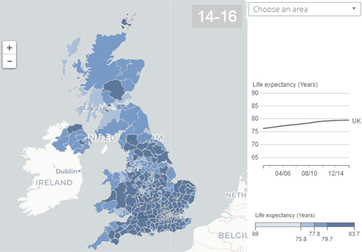
Female babies born in the UK this year can expect to live until they are 85.8 years old. If they are male then they can hope to live until they are 82.3 years old. However a new born's life expectancy can vary a lot depending on where they live in the country.

The UK's Office for National Statistics has released information on the Health State Life Expectancies 2014 to 2016, which examines life expectancy in each area of the UK. This ONS report includes two interactive maps; one visualizing life expectancy in each local area in the UK and the other showing the gain in life expectancy in each local area since 2001-2003.

Healthy life expectancy at birth can vary across local areas of the UK by 18 years. The best places to live if you want a long healthy life is Richmond upon Thames if you are male (69.9 years) and the Orkney Islands if you are female (73.0 years). The worst places to live are Dundee City for males (54.3 years) and Manchester for females (54.6 years).

Sunday, December 10, 2017

The First #uksnow of Winter


It's snowing! There's nothing quite like the excitement of waking to the first snow of winter, grabbing your phone and visiting the #uksnow Map.

The #uksnow Map maps the location of snow in the UK based on the number of tweets that mention snow. To add snow to the map you just need to include the hashtag '#uksnow' in a Twitter message and a UK postcode. You should also rank the amount of snow out out of ten (where 0/10 = no snow and 10/10 = a blizzard).

The #uksnow Map includes an option to view all the photos of snow that have been posted on Twitter. Just click on the photo icon attached to the Twitter sidebar and thumbnails of the photos will appear in the sidebar. Just click on any of the thumbnails to view the image in full-size.

Now where did I put put my sledge?

Saturday, December 09, 2017

Trees of Edinburgh


The Edinburgh Tree Map uses data from a number of sources to map Edinburgh's trees. The map uses colored map markers to show the locations of the city's trees by species.

Using the map menu it is possible to view individual tree species separately on the map or to view all species at once. If you select a tree on the map you can view its Google Maps' Street View image and details about the tree's height and age. Each tree also has its own unique URL (click on a tree to get its link), which means you can share a link to any tree on the map.

The Edinburgh Tree Map was built using Leaflet.js and the Carto Maps API. If you don't want to build your own map and database then you can create a tree map with OpenTreeMap, a paid service which was used to create the Los Angeles and San Francisco tree maps (linked below)

Other Tree Maps:

San Francisco
New York
Los Angeles
London
Melbourne
Madison, Wisconsin

Friday, December 08, 2017

The Most Fragile Cities Around the World


Three of the most at risk cities in the world, Mogadishu, Kismaayo, and Merca, are in Somalia. At the opposite end of the scale Canada, Japan and Australia are home to some of the least at risk cities.

Fragile Cities is an interactive map which allows you to explore the fragility of 2,100 cities around the world. The Fragile Cities project ranks cities using 11 different metrics, which consider areas such as income inequality, natural & man-made risks and access to services.

If you select a city on the map you can view its Fragile Cities fragility rank. You can also view how it ranks under all 11 of the fragility metrics. The map includes a number of themed map visualizations which provide a closer view of the fragility hot-spots around the world. The slide control at the bottom of the map also allows you to view the cities' fragility ranks for every year since 2000.

The Best Transit Networks in America


New York has the best transit network for commuters. San Francisco comes in a close second. However the transit networks in Cincinnati and Charlotte showed the most improvement in the last year in terms of providing the greatest increases in access to jobs by transit

Every year the Accessibility Observatory at the University of Minnesota ranks the most populated towns and cities in the United States according to how well they connect workers with jobs via transit. Essentially the rankings are based on how many jobs can be reached by employees in a given time.

This year’s report Access Across America: Transit 2016 shows the rankings for each city, listing the cities in order of the greatest job accessibility by transit. It also lists the cities which have shown the best year-on-year improvement. These are the cities with the greatest increases in job accessibility by transit.

The report is accompanied by a series of interactive maps which visualize the spatial patterns of accessibility within each city. For each city an interactive heat map show the number of jobs accessible in each census block area within 30 minutes (on public transit) between 7:00 and 9:00 am.

Town vs Country


German newspaper Zeit has noticed a divide in attitudes in many western countries between their rural and urban communities. This divide in attitudes was seen clearly in the last presidential election in the USA and in the UK's Brexit referendum. In both these cases there were clear differences between the way urban and rural communities voted.

Zeit Online therefore decided to find out if there was this same urban-rural split in attitudes in Germany. In Diving into Urban-Rural Prejudice the newspaper first set out to discover how many Germans live in the countryside and how many in towns and cities. They discovered that "almost 70 percent of all Germans live in places with a population of less than 100,000". Zeit has visualized this answer in a dot map and bar graph, which shows the percentage of Germans living in different sized communities.

In the rest of the article Zeit explores the attitudes of urban and rural communities to a number of social and political questions to discover if there really is a difference in attitudes between town and country. The newspaper discovered a number of areas where there are clear differences in social and political attitudes. It also discovered that some of these seem to have grown in recent years (perhaps in response to Germany's acceptance of a large number of refugees).

Thursday, December 07, 2017

Southern California Fires Maps


Two fires erupted overnight in Southern California. The Thomas fire in Ventura County has already burned 90,000 acres and threatens communities both on the coast and inland. The Creek fire is burning near Sylmar and has prompted officials to evacuate more than 8,000 homes. Authorities say that the fire may not be fully contained for two to three weeks.

Esri's Ventura Wildfires map displays active fire incidents and situation reports from the National Interagency Fire Center (NIFC) database. The map also includes the MODIS thermal layer. This uses the MODIS satellite detection system to show the location of hot spots that could be potential fire locations, as detected by MODIS in the last 24 hours.

You can also view the same information on Esri's US Wildfire Activity Public Information Map. This second map covers the whole of the United States, while the first map is concentrating on the current active fires in Southern California. The US Wildfire Activity Public Information Map visualizes US wildfire locations, perimeters, fire potential areas, global burn areas, wind conditions, and precipitation using a variety of different official sources. This map also includes news & media concerning wildfire activity taken from social media.

A Journey Along a Greenland River


The New York Times wants to take you on a journey down a Greenland river. A journey which helps explain how melting ice sheets can cause a rise in global sea levels. In Greenland Melts, Where's the Water Going? the NYT uses drone photos of Greenland to help explain how meltwater rivers flow through the ice sheets and into the sea.

As you scroll through the story map you are taken on a journey along a Greenland river. On this journey you will experience how meltwater from Greenland's ice collects and drains to form rivers. You will see how these rivers carve a path through the ice sheet and how the rivers eventually drain into the ocean and contribute to rising sea levels.

After you have finished this journey along a Greenland river the New York Times discusses the importance of new research which suggests that the ice sheets retain some of the meltwater from melting ice sheets. This new discovery should help improve climate scientists' understanding of rising sea levels and help to refine our climate models.

You may also like:

Sea Level Rise Viewer - NOAA's interactive map models how different extents of sea level rise will impact coastal areas in the USA up to the year 2100.
Rising Seas - a map which allows you to explore data from 500 sea level meters around the world which have been measuring sea levels since 1933.
Shrinking Glaciers Around the World - a collection of maps tracking how glaciers are shrinking across the globe

Wednesday, December 06, 2017

Mapping Rent in L.A.


The Los Angeles Times has mapped out Where You Can Afford to Rent in California. Using the newspaper's new interactive map you can view all the zip-codes in the state where you can afford to live based on your annual salary.

The L.A. Times' affordable rent map includes a slide tool which allows you to enter the amount of money you can spend on rent a month. After you have entered how much rent you wish to pay the map automatically updates to show where you can afford to rent. Each zip-code area is colored by affordability, based on the rental listings on Zillow.

You can also enter your salary into the tool. If you enter your salary then the map also tells you what percentage of your wage is being spent on rent. The L.A. Times suggests that "you spend no more than 30% of your gross income on rent and utilities".

Near Collisions in New York


Computer vision specialists Mobileye equipped City of New York vehicles with cameras which are able to detect the locations of pedestrians. Mobileye was then able to use these cameras to plot when and where City vehicles were in "near-collision events with pedestrians".

Mobileye has now teamed up with Esri to map this data in order to discover patterns and spatial trends in these near-collisions. The Mobileye and Esri story map introduces you to the project, explains some of the discoveries made into where & when near-collisions happened and also allows you to explore the mapped data for yourself.

If you scroll through to the end of the Mobileye and Esri map you will find links to two other maps, a Point, hex bin, and street map and a Time of day and heading map.The first of these maps uses hex bins to visualize the number of near-collisions on New York's streets. It also provides a breakdown of the number of collisions by time of day for each location. The second map uses colored markers to show at what time of day the most collisions occurred at each location.

Tuesday, December 05, 2017

Sanitation in the Rohingya Refugee Camps


The refugee camps in Cox's Bazar, Bangladesh are having to cope with hundreds of thousands Rohingya, fleeing religious persecution in Myanmar. The incredible overcrowding in the camps has led to conditions of poor sanitation and limited health care. Reuters has undertaken analysis of satellite photos of the camps to assess the use of latrines and water pumps in the camps and how their distribution and use might effect the well-being of those living there.

In The Rohingya Crisis: Life in the Camps Reuters has used recent satellite imagery to explore the number and placement of latrines, makeshift latrines, open defecation areas and water pumps. The news agency has identified those latrines which are too near or too far from refugee households. It has also identified makeshift latrines and open defecation areas, which have been built by the refugees themselves. Many of these are located in unsafe areas or are too shallow and therefore pose a risk of contaminating water pumps.


As more and more desperate refugees arrive from Myanmar the Kutupalong refugee camp grows in size everyday. The AFP news agency reports that it is set to house 800,000 people, which would make it the largest refugee camp in the world.

The AFP has interviewed a number of refugees who now live in the Kutupalong refugee camp. You can read their stories on the KFP's Kutupalong: Rohingyas Hit Dead End interactive map. The map uses a recent satellite image of the camp as the base-map for these refugee stories. The use of a satellite image is very effective in conveying the sheer size of the Kutpalong camp. The numbered markers on the map provide access to the refugees interviewed by the KFP. You can read these stories simply by selecting the markers on the map.

The Halifax Explosion


100 years ago tomorrow, on the morning of 6 December 1917, a French cargo ship carrying high explosives crashed into a Norwegian ship in Halifax Harbour in Canada. The resulting massive explosion killed 2,000 people in Halifax, injured at least 9000 more and destroyed every building within a 1.6 mile radius (over 12,000 in total).

CBC Canada has created an incredible 360 degree video which recreates the collision of the two ships and the explosion which led to the loss of thousands of Canadian lives. The video shows an animated 3d model of Halifax Harbour, the town on the shore and the SS Mont-Blanc and SS Imo. As the video replays the collision you can pan the camera around and explore the complete scene in 360 degrees.

As well as this 360 degree recreation of the explosion CBC Canada has mapped the damage the explosion caused to the town of Halifax. A City Destroyed: 100 Years After the Halifax Explosion includes a map showing the buildings burned, collapsed and wrecked. In Part Two of this web documentary you can also explore an interactive 3d model of Halifax. This model includes the damaged and destroyed buildings. It also includes a number of map markers which you can select to read about some of the victims and survivors of the Halifax explosion.


You can learn more about the individuals killed in the Halifax Explosion in Global News' interactive map of Halifax. The interactive map in The Halifax Explosion killed nearly 2,000 people. Here is where most of them lived shows many of the houses in Halifax where people lost their lives.

The numbered markers show the number of victims in each house. If you select a marker on the map you can view the names of the people who died in that home. You can even click those names to read the details about the individual which were entered in the Halifax Explosion Death Registration Book.

Global News has also created a Children's Map, which maps the homes where 437 victims who were 12 or under died. Again you can click on the names of the victims to read the details entered into the Death Registration Book.

Monday, December 04, 2017

Israeli Settlements in the Westbank


The Settlements and Solutions Project maps the locations and history of Israeli settlements in the West Bank. The map is designed to help further understanding of the political and territorial conflicts in the West Bank and of some of the 'Land Swap' scenarios which have been proposed in peace negotiations.

The 'Green Line' on the map is the armistice line drawn up after the 1948 Arab-Israeli war. This was the agreed border between Jordan and Israel until 1967. The red line is the West Bank Security Barrier, a physical barrier that Israel has been building since 2002. Israeli settlements in the West Bank are marked on the map in blue and Palestinian communities are shown in yellow.

You can click on the colored Israeli settlements and the Palestinian communities to view details about the population living in each area. The information provided for each Israeli settlement includes details about what year the settlement was founded, the number of buildings constructed and even information about how the people have voted in Israeli elections.

The map also includes visualizations of various Land Swap proposals. These show on the map territories which could be swapped between Israel and the Palestinians in proposed solutions to the problems in the West Bank. This includes Land Swap suggestions made in the 2008 Abbas-Olmert negotiations and in the Geneva Accord.

Macrostrat's Geologic Map of the World


The English geologist William Smith is credited with creating the first nationwide geological map. A geologic map reveals the distribution of geological features such as rock units or geologic strata. Smith's beautiful 1815 map visualized Britain's geological types using different colors for different types of geological feature (you can view interactive versions of William Smith's geological maps of England, Scotland & Wales at William Smith's Maps).

Macrostrat is a collaborative platform for geological data exploration and integration. They claim to have the world's largest geologic map database. Their interactive Geologic Map allows you to explore the geology of the whole world. If you click on the map you can view information on the age, lithology and geologic strata at your selected location. The Macrostrat Geologic Map also includes an option to view elevation profiles. If you select elevation profile from the map menu you can draw a line between any two points on the map to view an elevation chart beneath the map.

A Literary Tour of Rome


The Morgan Library and Museum has been inspired by August Hare's 1870 guidebook 'Walks in Rome' to create their own interactive map of the eternal city. Hare's original guide to Rome included a wealth of literary quotations about the city's magnificent ancient buildings and monuments. The Morgan Library and Museum's City of the Soul, similarly explores how Rome provided the inspiration for many nineteenth century authors and poets.

The interactive City of the Soul map was created for the museum’s exhibition on Rome and the Romantics.The City of the Soul allows you to explore Rome through the literary insights of a number of nineteenth century writers. If you select one of the city's famous locations on the map you can read from a selection of literary works which were inspired by the chosen building or monument.

The basemap used for the City of the Soul is Paul-Marie Letarouilly’s 1841 city plan. If you like Letarouilly's plan of Rome then you might also enjoy this fully interactive version of Lanciani's Forma Urbis Romae. At the turn of the 20th Century Italian archaeologist Rodolfo Lanciani undertook the task of creating a huge detailed map of Rome. A map which would visualize when different parts of the city were built.

Lanciani’s Forma Urbis Romae is color codded to show the different historical epochs when different areas of Rome were built. On the map ancient and medieval Rome is shown in black, early modern Rome in red and the modern city (to Lanciani) is shown in blue.

Saturday, December 02, 2017

1000 Years of London History


Layers of London wants to map the history of London from the time of the Romans right through to the modern day. That is a lot of history. So it needs your help.

Layers of London is already working with a number of partners, including the British Library, Historic England, The National Archives, London Metropolitan Archives and the Museum of London Archaeology. However it will also be crowd-sourcing content. Anyone who has an interesting historical story to tell about a place in London can pin their story to the Layers of London map.

Layers of London is for now in a beta phase of testing. Currently when you browse Layers of London you can view two historical maps of London on the map, the Morgan map (1682) and Roque map (1746). It is also possible to view some historical aerial photos of London captured by the RAF.

The historical notes are shown on the map using map markers. These historical notes can be filtered in two ways. You can use the timeline to explore London's history by date range. You can also select to view from a number of curated and public themed 'collections'. These collections allow you to browse London's history by theme, subject matter or from a particular institution or organization.

The timeline and themed 'collections' on Layers of London reminds me a little of History Pin. This crowd-sourced map of historical photos, videos, audio recordings and memories has proved hugely successful around the world. If Layers of London can also tap into this demand for local and personal history then it could also become a successful portal of crowd-sourced history.

Friday, December 01, 2017

Mapping the Military's Pollution


The military are one of America's biggest and most prolific polluters of the environment. The United States military and its contractors are the only people in the United States still allowed to dispose of hazardous waste using highly polluting 'open burn' sites. It makes full use of this exemption.

ProPublica has been investigating the military's use of open burn sites and the potentially lethal pollution that they cause. In Open Burns, Ill Winds they examine how the military gets rid of hazardous material at a potentially huge cost to the health of people living nearby.

ProPublica has for the first time mapped all of the military's 'high' and 'medium risk' hazardous sites across the country. Bombs in Your Backyard is an interactive map which shows the location of current and former military locations which contain toxic pollutants and contaminants in the soil or water. It also shows military sites that contain explosives or discarded military munitions.

If you select a state from the drop-down menu you can view a list of the military installations in the state with the most high & medium risk sites. The map sidebar also includes a list of the number of military installations in each state with high & medium risk hazardous sites.

Thursday, November 30, 2017

Bike Thieves of Toronto


CBC Toronto has used data from Toronto police to map where bikes were stolen in Toronto from 2014 to 2016. The Toronto Bike Theft Map reveals that downtown Toronto experiences the most bike thefts but other neighborhoods, such as Willowdale West and Lansing-Westgate have also seen a rise in bikes being stolen since 2014.

The map includes a number of options which allow you to filter the map by year, type of bike and the type of location where they were stolen from (e.g. apartment, outside, house). When you select a type of bike or type of location the map automatically updates to only show the bike thefts which match your selected type. The actual number of bike thefts matching your type is also displayed.

The accompanying article explores the data and reports on the neighborhoods which have seen the most bike theft crime and the types of location which are seeing a rise in bike crime. It also includes some handy tips about how you can secure your bike and help protect it from being stolen.