Monday, March 31, 2014

Live Streaming Street View on Google Maps


Live streaming Street View is coming soon to Google Maps. The new imagery will be similar to the present Street View only, instead of using still images, it will involve real-time streaming images. Once the new streaming Street View goes live you will be able to click on Google Maps and actual see what is happening at a location live and in real-time.

Here's a little background on this story:

Yesterday I was contacted by a developer in Switzerland. While poking around in the javascript for Street View he spotted a reference to 'streaming_streetview'. The developer e-mailed me asking me if I had any idea what this might be referring to.

In the code the reference to streaming Street View has a location attached to it but when you open the Street View in Google Maps it just displays the normal static Street View. However the reference to 'streaming_streetview' also has a panoID attached to it. I therefore decided to use the Google Maps API to create a Street View instance and entered in the panoID.

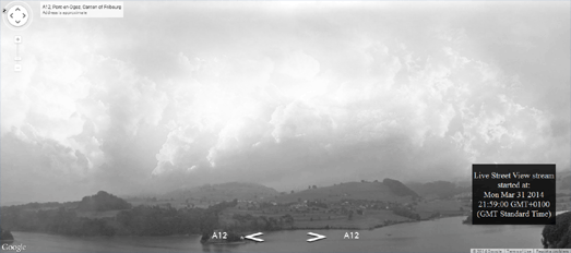
The result is an amazing real-time streaming Street View from the location. I've put this little hack on-line and you can see Google's test demo of streaming Street View in action for yourself - here.

Yesterday I also tried to get in touch with a few of the people I know in the Google Maps team, in order to try to get some more information on this. At first Google, as ever, were very tight lipped about this. However, once I told them I was going to publish news of this anyway, I did manage to get a statement out of Google.

Here's what Mike Marks, of the Google Maps Development Team, told me,

"We are working on introducing streaming Street View on Google Maps. However we are presently a long way from going live with this. At the moment we have a number of logistical and privacy issues that we need to resolve before we are ready to add streaming Street View to Google Maps.

I can't tell you much about the logistical problems because that will give away the camera locations - and we don't want to give that information out yet. The other issues we have are to do with people's privacy. We have been working on updating our face blurring technology so that we can hide people's faces as they walk around on camera. We have come a long way with that but we still have some work to do before that technology is perfected. Rest assured we will not be releasing streaming Street View until we are certain that we can protect people's privacy when they appear live on Google Maps"

So it appears we have a little time to wait before live streaming Street View is released on Google Maps. While you wait you can check out the little secret demo of the technology that Google are testing here. Currently the test camera is broadcasting in black & white. Hopefully Google will be switching to color cameras before they eventually do go live with this on Google Maps.

Google Maps Pokémon Challenge

Google has finally added the location of wild Pokémon to Google Maps. Google Maps on Android and iOS is now populated with 150 Pokémon.

What's more you can use Google Maps to capture the Pokémon and enter the Google Maps Pokémon Challenge. The 150 Pokémon are located throughout the world, so you will have to be a Pokémon Master to capture them all. If you need a little help in getting started in your search then have a look around the Googleplex in California.


If you find a Pokémon while browsing Google Maps on your phone just tap the creature and you can catch it. The Pokémon is then added to your Pokedex (that's your own personal Pokémon catalog). Every time you capture a Pokémon you take a step forward in your challenge to become the ultimate Pokémon Master.

Depth in Street View


You must have seen Urban Jungle by now. Urban Jungle is a fantastic website that allows you to view Street View scenes enhanced with some virtual jungle greenery. The effect is possible because of undocumented depth data stored in Street View. Urban Jungle is able to use that data to create a depth map which can be used to plot geometry and sprites in the 3d space of the Street View panorama.

Urban Jungle uses the Street View depth library, GSVPanoDepth, developed by 0xef. 0xef has also used the library to create HyperlapseMB, which adds a nice motion blur effect to Hyperlapse's Street View animated drive creator.

Street View Hyperlapse uses Hyperlapse.js, Three.js, GSVPano.js, and the Google Maps API to create really smooth animated Street View movies. In Hyperlapse you just need to drop two map markers on a Google Map, for the start and end of your drive and then press 'create'. The result is an amazing animated drive through a series of Street View images.


HyperlapseMB uses the depth information hidden in the Street View data to create a nice motion blur effect to the created animated drive. The motion blur eliminates a lot of the jerkiness in the resulting animation, which is caused by stitching a sequence of still images together. The result of adding motion blur is a much smoother animation.

HyperlapseMB applies the motion blur effect before the Street View animation can be played. Therefore HyperlapseMB is a bit slower than the original Hyperlapse, but it is worth the wait. Not only is the animation much smoother but the controls in the side-panel allow you to adjust the view in the animation and even spin the animation around.

Sunday, March 30, 2014

The Maps of the Week


This clever map uses the underlying data for roads in OpenStreetMap to calculate the road orientation patterns for any location. Using the map you can zoom in on any area of the world and a rose diagram displays the road orientation distribution within the current map bounds.

The VeloViewer interactive map allows you to view the road direction pattern for any district or city in the world. You can move the map around and zoom in or out on any location and the rose diagram will update on the fly to show the road direction distribution within the current map view.


The Autocomplete Map Maker is another clever map. Using the application you can create a Google search autocomplete map using any search terms that you want.

Enter search term(s) into the Autocomplete Map Maker (both suffixes and prefixes are accepted) and you can create your own fun map, based on the Google search autocomplete suggestions for your chosen words. For example, for the map above I entered 'why is' as the prefix and 'so' as a suffix and the wizard automatically created a map of US cities based on Google's autocomplete search terms.


This week I also want to give honorable mentions to two experimental transit maps. The MTA.me Conductor has turned Massimo Vignelli's 1972 New York subway map into a real-time string instrument. The map visualizes in real-time trains moving on the MTA subway network and plays a note every time a subway train crosses the track of another train.

Bruno Imbrizi's Experiment No.7 is a 3d map of the London Underground, with tube stations and animated real-time trains. The map is fully interactive, so you can pan and zoom the map to explore the depth of the different underground lines.

The World Map of Oil and Gas Exploitation


Drilling Maps is a crowd-sourced map of health and safety issues near oil and gas operations. The map documents water & air quality pollution, and other issues related to oil and gas operations. The map also contains a vast amount of data about the location of oil and gas drilling sites and gas pipelines around the world.

The green markers on the map are oil and gas drilling sites, the pink markers denote power plants and the red markers refineries. The blue markers on the map indicate where health and safety issues have been reported.

The map includes a powerful search function that allows you to search the data presented on the map by location and an 'add' form which allows you to report health and safety issues to the map.

Saturday, March 29, 2014

Adding Depth to the London Tube Map


Harry Beck's London Underground map is rightly lauded as an iconic landmark in the history of transit map design. However Harry Beck's tube map is missing two important features: depth and live trains.

Luckily Bruno Imbrizi's Experiment No.7 overcomes this deficiency in Harry Beck's famous map. Experiment No.7 uses the three.js library to create a 3d map of the London Underground, with tube stations and animated real-time trains. The map is fully interactive, so you can pan and zoom the map to explore the depth of the different underground lines.

The map even includes a background soundtrack so that you can experience the audio joy of traveling on the London Underground while you browse the map.

If you enjoy this experimental transit map you might also like MTA.me Conductor, the musical New York subway map.

Google Naps


It only takes one letter to go viral. I've been watching Google Naps for the last few days and it has very quickly become more and more populated with user suggested locations of where you can go to have a quiet nap.

Google Naps doesn't exactly strike me as fulfilling a need that the world has been crying out for. So why has it so quickly become so popular? Do we really need a map to help find nearby places that we can go for a quick snooze? I think not. Google Naps has gone viral because of its humorous name.

I suspect that right now map developers around the world are working on other puns on Google Maps. In the coming weeks I expect to be reviewing a map of rugs around the world (Google Mats),  a map of drinking fountains (Google Taps) and a map of public rest-rooms (I leave that one to your imagination).

Friday, March 28, 2014

The Musical New York Metro Map


MTA.me Conductor has turned Massimo Vignelli's 1972 New York subway map into a real-time string instrument. The map visualizes in real-time trains moving on the MTA subway network and plays a note every time a subway train crosses the track of another train.

Every minute the application checks for new trains launched from their end stations. The trains are then animated along the subway line with their speed set by the MTA schedule. When one train crosses the track of another train a single note is played.

Fire-up the map and you can just sit back and listen to a New York subway symphony being composed and played in real-time. You can even join in the composition by plucking the strings of the trains of the New York subway.


If the New York subway can be a stringed instrument I see no reason why the map of Ohio can't be a piano. Ohio has 88 counties, a piano has 88 keys, so obviously Ohio is a Piano!

Well, it is on this amazing Google Map. Cartogrammar has mapped each county of Ohio to a particular piano key depending on various data attributes. This means that you can play Ohio on this Google Map just as you would play a piano, except here you press the counties rather than tinkle the ivories.

The map has 'The Entertainer' already programmed in, so if you never learnt to play the Ohiophone you can just press play and sit back and listen. Alternatively, if you have always wondered what Google Driving Directions would sound like if each county you passed through played a different note (and come on who hasn't always wondered that), you can select a route from any county to any other county and listen to the route being played live.


If the New York subway can be a stringed instrument and Ohio can be a piano then Aberdeen can be an orchestra! Marker / Music lets you mix your own music by clicking on different locations and playing the music recorded there. You can combine any of the recordings to create your own unique mix directly from the map.

Darren Solomon and the students and faculty of Northern State University shot over 70 videos of instruments being played around the town of Aberdeen. Twelve of the videos have been added to this Google Map. If you open up the videos you can play and mix the sounds being played in each video. You can even adjust the volume of each video / instrument.

You might expect that the result of opening different videos and mixing different instruments would be a cacophony of sound but I've played with this for a while and each & every mix resulted in a serene and mellow musical composition.


If the New York subway is a stringed instrument, Ohio is a piano and Aberdeen an orchestra then Google Maps can be a record.

Rock Around the World is a Google Map shaped to look like a record. Click on the map and the record spins around and plays Rock Around the Clock. Once you take your mouse off the map the record slows its spin and comes to a stop and the song slows and grinds to a halt.

French Hardcore users of Leaflet.js


Razibus is a Leaflet.js map of upcoming Punk, Ska and Hardcore concerts and festivals in France. Alternative music fans can use the calendar in the side-bar to view upcoming gigs for any week, simply by clicking on a date on the calendar


If you select a marker on the map you can click through to view the event details and view the concert's flyer or poster. Razibus also contains an archive of alternative music gigs going back to 2007. It is therefore a great resource for anyone interested in alternative music in France or for those who love Punk poster art.

Thursday, March 27, 2014

The Illustrated Map of New Zealand


Pure Journeys allows travelers in New Zealand to organize and book self-drive holidays. The site includes a beautiful interactive illustrated map of the country.

You can navigate around the map by mouse click & drag or use the small inset Google Map to quickly drag the map view around. The map includes interactive map markers over the major cities. If you click on the markers the available Pure Journeys trips available from the city will appear in the sidebar.

Mapping HIV/AIDS in San Francisco


The San Francisco Department of Public Health has released an Atlas of HIV/AIDS in San Francisco. The map helps identify areas of the city with relatively high rates of new infection and help guide the placement of prevention services.

The map reveals that the Castro remains home to the largest number of those living with HIV/AIDS and those newly infected. The map includes data from 2003-2010 and can be filtered by year, sex, age and race. It also possible to explore survival rates in each of the San Francisco neighborhoods.

Map Your Facebook Likes


Like Map is a cool way to map all the pages you have liked on Facebook. Many pages you 'like' on Facebook have a physical address and using Like Map you can view them on a Google Map.

To create your own map of your Facebook likes you simply need to sign-in to Like Map with your Facebook account. Your map is then created automatically. The map is an interesting way to visualize your Facebook likes.

For me the map was quite revealing about how Facebook seems to be able to elicit 'likes' out of you without you even realizing. I had no idea I had liked so many pages on Facebook. In fact the only location that appears on my map that I can actually remember 'liking' is the shop in the screenshot above.

Wednesday, March 26, 2014

Visualizing Road Direction Patterns


Over the last few days Visual Statistix has been publishing a nice series of maps showing the road direction patterns in American and European cities. These static maps with accompanying rose diagrams are a great visualization of urban road patterns. They are particularly illuminating in illustrating the differences between the planned grid-patterns of American cities and the more organic sprawl found in European cities.


VeloViewer has now released an interactive map that allows you to view the road orientation for any district or city in the world. Using the map you can zoom in on any area of the world and a rose diagram displays the road orientation distribution of the current map bounds.

The map uses the underlying data for roads in OpenStreetMap to calculate the road direction patterns on the fly. This means that you can move the map around and zoom in or out on any location and the rose diagram will update on the fly to show the road direction distribution within the current map view.

Health Care Professionals on Twitter


Creation Pinpoint has used CartoDB's Torque library to create a mapped visualization of the growth of health care professionals on Twitter. The map is interesting itself, animating the number of health care professionals on Twitter over time.

Creation Pinpoint has also released a video of the map with an accompanying animated line chart. The line chart doesn't appear on the actual map, so it is possible that the line chart was superimposed in video post-production. However it should be possible to hack a CartoDB map to display an animated line chart in this way, after all the data is all there.

I think this would be a great addition to the Torque library. If you want to give this hack a go the code for Torque is available on GitHub. If you succeed please let me know.

NOTAMS for Pilots on Google Maps


Zweefvlieg is a new Google Map that displays Notices To Airmen (NOTAMs) that could affect Dutch gliders. NOTAMs are messages issued by governmental agencies that warn pilots and operators of aircraft of last minute changes that could affect a flight, such as the closure of a section of airspace.

The map shows the NOTAMs released daily by the Royal Netherlands Airforce for Dutch airspace. NOTAMs affecting airports are displayed with plane icons on the map. NOTAMs affecting airspace are displayed using circular polygons.


Zulu for Pilots is a Google Map that helps pilots find Notice To Airmen (NOTAMS) issued by NavCanada.

Using the map it is possible to search for Canadian airports by their ICAO code and find nearby NOTAMS. Airports are marked on the map with large map markers and clicking on the marker will display all the NOTAMS for that airport in the map sidebar. Obstructions on the map are represented by small markers.

NOTAMS are updated from NavCanda’s website every 30 minute and the time of the last update is displayed above the map.

Tuesday, March 25, 2014

Explore Sunken Ships in Street View


The USS Mohawk was a US Coast Guard cutter. She was sunk on July 2, 2012 off the coast of Southwest Florida. She is the first dedicated veterans memorial military ship reef and is becoming a popular destination for scuba divers.

However you don't need to travel to Florida to take a tour around the sunken USS Mohawk as you can now explore the scuttled ship on Google Maps Street View. You can view the Street Views on Google Maps Views, with some added information about the cutter or you can view the cutter directly on Google Maps.


Google in partnership with the Catlin Sea Survey have also captured undersea Street View imagery of the wreck of the paddle steamer the Mary Celeste.

The Mary Celeste was a blockade runner used during the American Civil War on behalf of the Confederacy to smuggle goods in and out of America. If you want to know more about the Mary Celeste then check out this little biography of the Mary Celeste that I put together with the help of jQuery Waypoints and the Google Maps API.


Indoor Street View imagery of the submarine HMS Ocelet is also available on Google Maps. HMS Ocelot is an Oberon-class diesel-electric submarine, that once served in the UK's Royal Navy. The sub now serves as a museum in Chatham Historic Dockyard.


This indoor tour of the submarine on Google Maps lets you explore all over the vessel and gives great views of the cramped sailor's quarters, the engine room and the ship's torpedo tubes.

Are You F..cking Hungry Yet?


If you always have problems deciding where you should eat then WTF is for Lunch can make that decision for you. The application determines your current location and your past choices and quickly comes up with a suggestion of a nearby restaurant.

WTF is for lunch also provides a handy Google Map showing you where the restaurant is located. For the terminally undecided the application also allows you to reject the suggested venue and get another nearby option for lunch.

If swearing offends you then you might want to give this app a miss.


If swearing really does offend you then you should also avoid Where the F..k Should I Go for a Drink? and Where the F..ck Should I go to Eat? However if you want some blunt advice about where you can get a nearby drink then carry on ...

If you share your location with either of these two apps you will be shown a Google Map of your current location with directions to a nearby bar, pub or restaurant. Above the map is a large (and rude) question that gives the name of your suggested local watering hole or restaurant.

If you click on the named venue in the map headline you can visit the suggested locations's website. If the suggested venue doesn't please you then you can click to get an alternative f..cking recommendation.

Why are foreigners so rude?


It can be tough being an English speaker travelling abroad, especially in countries where they don't speak English. I find that the louder I shout at foreigners to help them understand the ruder they get.

This is obviously a common experience of people when travelling abroad. At least judging by my Nationalities Autocomplete Map. This map shows the autocomplete suggestions of Google search when you type in 'Why are (nationality) so ...' The results suggest that everyone wonders why the English, the Czech, the Germans, the Spanish, the Russians and the Indians are all so rude.

People seem to be equally dumbfounded by the niceness of the Canadians and the stupidity of the Americans.

Another problem when travelling abroad is all that foreign food. The Food Autocomplete Map shows Google search autocomplete suggestions for queries in the form of 'Why is (nations) food so ...'. Based on this map you should avoid visiting America, Greece, Russia, Spain (all bad food) and England and Poland (bland food). Instead, to guarantee a good dining experience, you should head for France, Germany, Mexico or Japan (all good food).

Both these new autocomplete maps were created in a few minutes using the new Map Channels Autocomplete Map Maker.

Mapping Life on Earth


The Map of Life is an impressive attempt to map life on Earth.

Using the application it is possible to click on a Google Map and get a list of all the different types of bird, fish, reptile, amphibian or mammal that live in a set radius around that location. For example, if I click on my address the map returns a list of 168 different types of bird and 32 different types of mammal.

It is also possible to use the map to view the worldwide habitats of different species. If you enter the name of an animal species the map will shade in the areas of the world that the animal inhabits.


The USA National Phenology Network's Phenology Visualization Tool helps monitor the influence of climate on the phenology of plants, animals, and landscapes in the U.S..

The site allows users to select a plant or animal and view where that species has been reported on a Google Map. It is then possible to view an animation of the species' phenology (phenology refers to recurring plant and animal life cycle stages) through time.

It is also possible to view climate data on the same map. Users can view maximum temperature, minimum temperature and precipitation either by month or annually. If you animate species data through time, with climate visible, you will see the climate data on the background change alongside the phenology data.


The Atlas of Living Australia is the public face of a $64.7 million initiative, funded over 6 years by the Australian Government. Using the Atlas users can find, access, combine and visualize data on Australian plants and animals. It aims to enable any user to quickly locate and access information on all aspects of Australian biodiversity.

The website uses Google Maps to allow users to search, analyse and combine biodiversity and environmental data geographically. The Species Map allows you to search for species by common or scientific names. Occurrences are then mapped as points or as numbered cluster markers. Clicking on the map at a particular location returns a query on how many occurrences of particular species are in a 10km radius from the selected point.

The application comes with a long list of contextual layers. All are well referenced to metadata with auto-generated legends for easy identification of what various color scales mean. Created maps can be saved as images for further reuse.


The Web of Life provides a Google Maps based interface for easily visualizing and downloading data on ecological networks of species interactions.

The map displays circular markers where ecological networks are located. The color of the markers indicates the type of ecological interaction of the network. Red markers show pollination and yellow markers seed dispersal. If you left-click on a marker you can view information about the network, including the number of species, number of interactions and the name of the species.


The OBIS-Seamap uses Google Maps to show the distribution and the ecology of marine mammals, seabirds and sea turtles across the globe.

It is possible to search and view data on the map for a number of different marine species. It is also possible to filter the data shown on the map by taxon group; 'sea bird', 'sea turtle' or 'marine mammal'.

Why are Arsenal so bad?


I've been having a lot of fun over the last two days playing with the new Map Channels Autocomplete Map Maker.

One of the great features of this wizard for creating your own Google search autocomplete maps is that you can use a kml of your own locations. This morning I created a kml of all the English Premier League teams to find out what the Google autocomplete suggestions were for English football clubs.

The English Premier League Autocomplete Map isn't actually that enlightening. Most of the results are asking why teams are so bad, or for a very few teams why they are so good. Manchester City are one of the few clubs to elicit another response. As far as City are concerned most people seem to be wondering why they are so rich.

However if you click on any of the teams' label on the map you can view a list of Google Autocomplete search suggestions for that club. For example if you click on the Manchester United label on the map you will see a range of responses, including:

Why are Manchester United so bad this season?
Why are Manchester United so popular?
Why are Manchester United so successful?
Why are Manchester United so good?
Why are Manchester United so hated?

(If you are wondering about the answers to those Man Utd questions - here they are: David Moyes, glory hunting fans, they aren't anymore, they aren't anymore, glory hunting fans.)

Monday, March 24, 2014

Why is Australia so hot?


I've been feeling a bit sorry for Australia. Recently I've being seeing a lot of those Google search autocomplete maps for American states and European countries but none exclusively for Australia. I've therefore used Map Channels' awesome new Autocomplete Map Maker to create a couple of Australian autocomplete maps.

The Why is Australia map shows the Google autocomplete results for Australian states and major cities when you type in 'Why is (state) so ...' into Google. From the resulting map I can only assume that Australians travel around their country in a state of constant surprise about how hot their country is. Except when they get to Canberra when they only want to know why it is so cold.

Australia Needs is a similar map, only this time the map shows the autocomplete search results when you type in '(state) needs ...'.  Apparently Australia is in need of a major construction drive, because Melbourne needs a theme park, Adelaide needs taller buildings and Brisbane needs more bridges.

If you want to create your own Autocomplete map then check out the new Autocomplete Map Maker which allows you to create your own map using any Google search terms.

How to Visualize Crime by Location


The effectiveness of a good crime map owes a lot to the flexibility it provides users in filtering the visualization of crime by location, type of crime, date and time of day. The San Francisco Crimespotting map provides a great example of how you can give users control over the visualization of crime data.

The map uses colored map markers to show the location of different types of crime. You can filter the types of crime displayed by using the controls in the map sidebar. You can also mouse-over the individual crimes listed in the sidebar to view all those crimes highlighted on the map.

The 'date' and 'time of day' controls also allow you to filer the results shown on the map by any date range or for any period or combination of periods during the day.

The Autocomplete Map Maker


I'm sure you've seen at least one of the popular autocomplete maps that have been doing the rounds over the last few months. These maps use Google search autocomplete to show what are the most popular search terms for locations around the world.

Well now you can create your own with the Map Channels Autocomplete Map Maker. I promise you that you are going to have a lot of fun playing with this, as you can enter any search terms that you want and almost instantly view the results on your own map. You can even embed your created maps in your own website.

Using the Autocomplete Map Maker you can create your own map in a matter of seconds and using whatever search terms you want. The wizard allows you to enter any search terms (both suffixes and prefixes) and then automatically creates your map built on Google autocomplete suggestions.

So, for example, you can enter 'Why is' as your prefix and 'so' as your suffix and you will get your own map of the world, displaying all the popular search entries for the countries in the world - Why is America so violent?

There are some very clever things going on with the Autocomplete Map Maker. The map automatically retrieves the autocomplete search results for your own terms from Google search. It then adds labels to a Google Map showing the results. You can select to view either the results for countries or for US states. You can even use your own KML of locations to customize the map to show the results only for your own locations (for example here is a map I created using a kml of some of America's cities).

The labels on the map are displayed using an enhanced version of the Google Maps label library. Map Channels has enhanced the library so that the labels don't overlap. Where two labels might overlap on the map, one is removed and is only shown as the user zooms in. This is a great enhancement to the map label library and I'm going to try and persuade Map Channels to release the code on Github.

Mapping the History of the Winter Olympics


There are some nice Google Maps integrated into this website about the Winter Olympic games.

Olympic Story is a well-designed website examining the history of the Winter Olympics. Olympic Story allows you to select any of the venues that have been used to host the Winter Olympics to discover interesting information about each games, such as the number of participating countries, the number of athletes and of course information about who won all the medals at each games.

For each of the venues which have hosted the Olympic Games you can view a Google Map visualizing which countries medals were awarded to. You can select to view the destination of gold, silver, bronze and all medals. The total number of medals won by each country are represented on the map by the thickness of the lines connecting each country.

Sunday, March 23, 2014

The Maps of the Week


This Bing WebGL Demo is very clever. The demo uses Bing Map tiles, elevation data and BabylonJS to create an animated 3d drive-through of any route.

Enter a starting point and a destination into the demo and you can view a drive-through of the calculated route in 3d. You can speed-up or slow-down the rate of the animation and you can drag the map around to change the direction of your view.

The demo includes a menu of a few pre-configured routes or you can enter your own locations to generate a route. If you want to view your own route then I suggest you enter somewhere with hilly terrain to get the full 3d effect of the elevation data.


In the 1830's John Tallis published 88 pamphlets entitled 'Tallis's London Street Views'. These guides included a local map and sketched street views of a number of London's main commercial roads. It was, if you will, the Google Maps of Georgian London.

The Museum of London owns a number of these pamphlets and has created an amazing 'Street View' type application that allows you to virtually walk down and around 35 of these 19th Century London Streets. In London Street Views 1840 you can view the Tallis illustrations for each street and compare them to the modern view today as seen in Google's own Street View application.

However you should probably ignore the Google Maps Street View and just open up the 19th Century Tallis Street Views in full-screen mode. You can then pretend to be Jane Austen and twirl 360 degrees around these London streets and take your evening constitutional up down the Georgian London streets.


M+, Hong Kong’s museum for visual culture, has released an interactive online exhibition celebrating Hong Kong’s neon signs. Neon Signs explores, maps and documents the city's wonderful neon signs.

The public can upload images of their own favorite neon signs from throughout Hong Kong and they will appear on the Neon Signs Google Map. The map itself uses the Styled Map feature and custom map markers to create a unique looking map. The markers use horizontal neon colored lines that stand-out on a black and grey themed map.

The black and grey map tiles also ensure that the colorful photos of the city's neon signs appear bright against the dark map background.

Saturday, March 22, 2014

The Most Famous Locations in Rock


From the crossroads where Robert Johnson sold his soul to the devil to the auditorium where Ozzy Osbourne bit the head of an unfortunate bat Fox in Rioh has mapped out the most important locations in rock 'n' roll history.

Fox in Rioh is a Google Maps that displays "the 440 destinations that made the history of rock 'n' roll". Click on any of the markers on the map and you can view the location in Street View, listen to a narrated story of why the place is important to rock history and read an account of the mapped location.

Two drop-down menus allow you to select locations associated with specific artists or choose to filter the locations shown on the map by genre of music.

The Best Mortgage Rates on Google Maps


We do like a first on Google Maps Mania and this is definitely the first map of mortgage interest rates that we have seen. SvD Näringsliv has released a Google Map that allows its readers to add the location of their bank to the map and indicate how much their mortgage interest rate is.

Other users can then use the map to research banks in their area to discover which ones are offering the best mortgage interest rates. They might even discover that their own bank has offered someone else a lower deal and can then use the information to try and renegotiate their own interest rate.

The SvD's Räntekarta includes a number of useful controls that allow the user to filter the banks displayed on the map. The slide control at the bottom of the map allows you to filter the results by the interest rates charged. If you only want to view banks offering rates between 4-6% you simply adjust the sliders to filter the results shown on the map.

The menu in the map sidebar allows you to filter the results by bank name or by location.

Friday, March 21, 2014

Greenpeace Maps New Zealand Oil Spill


Oil company Anadarko will begin deep sea exploratory drilling this summer off the coast of New Zealand. In response Green Peace New Zealand has released the Oil Spill Map, which models the likely effect of an oil spill from two sites that have been targeted for deep sea drilling.

The map animates the likely effects of a blowout on either of the two rigs and the drift of the likely oil spill. Each animation progresses in daily stages, showing the growth of the oil spill and the presumed response by the New Zealand authorities.


Into the Arctic consists of a number of mapped stories recounting Greepeace's fight against oil drilling in the Arctic.

One of the stories includes a time-line and map of the events leading up to the illegal boarding of the Greenpeace ship Arctic Sunrise by the Russian coast guard and the arrest of all on board. The map shows the journey of the Arctic Sunrise from July 1st when it set sail on its mission to expose the dangerous oil drilling in the Arctic. It includes an account of the ship's mission and also tells the stories of some of the activists that were arrested and placed on trial in Russia.

Mapping Boston's Gas Leaks


The Conservation Law Foundation has released an in-depth report into Massachusetts’ antiquated natural gas distribution system. Much of the ageing Massachusetts’ gas pipeline system is very old and prone to leaks, creating a significant public safety and environmental hazard.

The Conservation Law Foundation's report into Massachusetts' Triple Threat discusses in detail the safety threat of gas leaks, the risk to the environment and the cost to gas customers. Each of these main sections of the report is illustrated with an accompanying interactive map.


The three maps visualize gas leaks by grade level, methane emissions and where gas leaks have been repaired.

One frequent problem that I come across in online long form journalism is embedded maps that are squeezed into a small space to save on valuable screen real-estate. The Massachusetts' Triple Threat report manages to neatly overcome this problem by providing a full-screen option on each map.

How to Avoid Hipster Social Suicide


Over the last few years I have found it more and more difficult to avoid the social embarrassment of being spotted in a hipster pub or bar. It is an unfortunate fact of modern life that the nicer a drinking establishment is then the more likely it is to be suddenly overrun by this plague of modern inner-city society.

Luckily however I have discovered that no-one else actually wishes to risk the social suicide of being seen in a hipster venue. It is therefore very easy to spot a hipster bar or pub by being able to recognize the disguises worn by the embarrassed patrons.

On first entering a pub you should look very closely at all the customers. If all the young men are wearing ridiculous false beards you should make as quick an exit as is humanly possible. The danger with this method however is that you may still be spotted leaving the hipster bar. It would therefore be much better if you actually had a hipster map that allowed you to avoid entering these traps of social suicide in the first place.


Luckily if you live in the Australian city of Melbourne you now have such a map. The Hipster Map of Melbourne is a handy guide to venues that you wouldn't want to be seen dead in.

The map includes a number of categories, which means that if you are looking for somewhere to eat, drink or buy clothes in Melbourne you now have a handy map of places to avoid.


The rating and review service Yelp has also released a Google Map that can show you where the hipsters hangout in your city.

The Yelp Wordmap is a series of heatmaps of common words used in Yelp reviews. One of the words is 'hipster' which means you can use the map to avoid being seen in a hipster venue. If you select 'hipster' from the available words in the map sidebar and then select a city (from a choice of 14 cities worldwide) you can view a heatmap of where the hipsters hangout in your town.